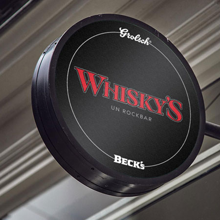
Whisky’s had been a landmark rock bar for years in the center of Osnabrück. In 2017 Alexander Schröder and his now wife Carolin Hermjohannknecht decided to take over the bar, which by that time was in serious need of a fresh start.
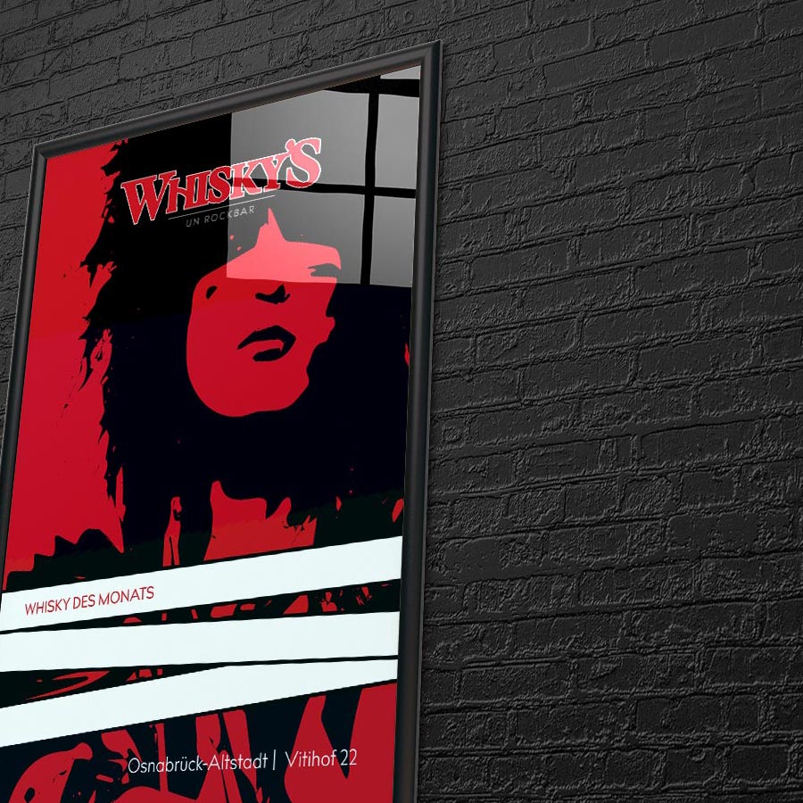
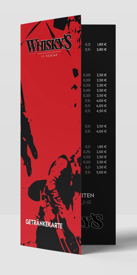
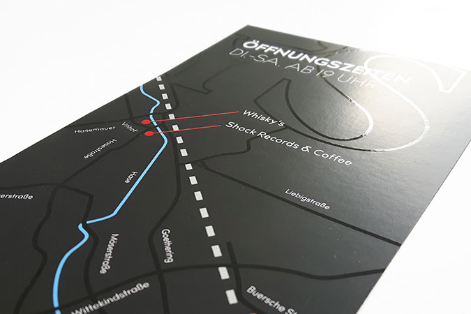
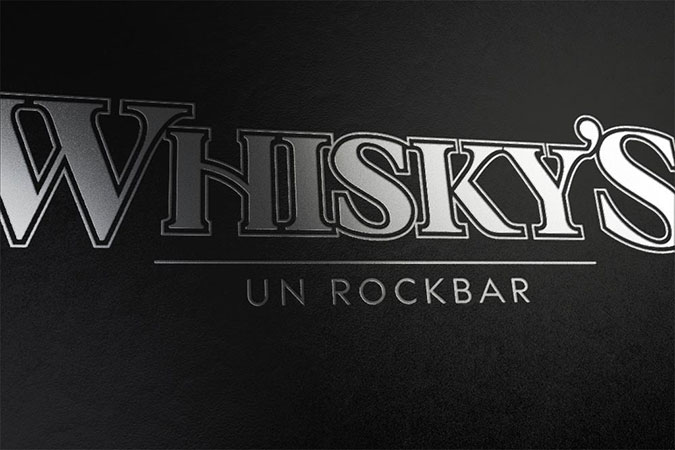
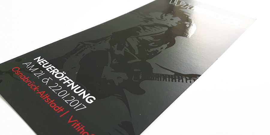
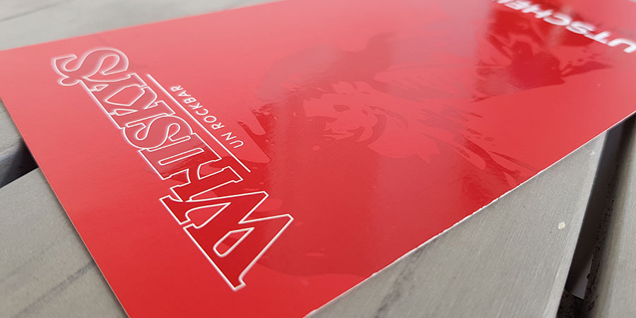
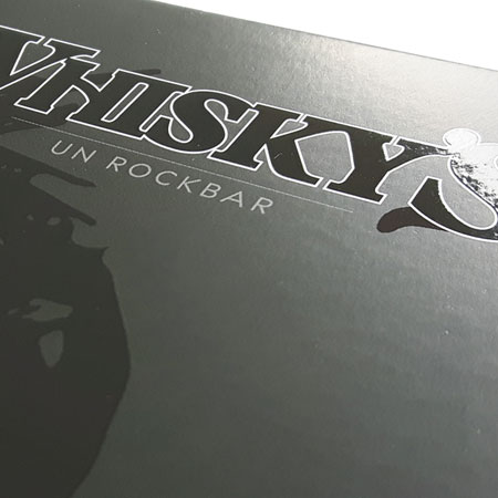
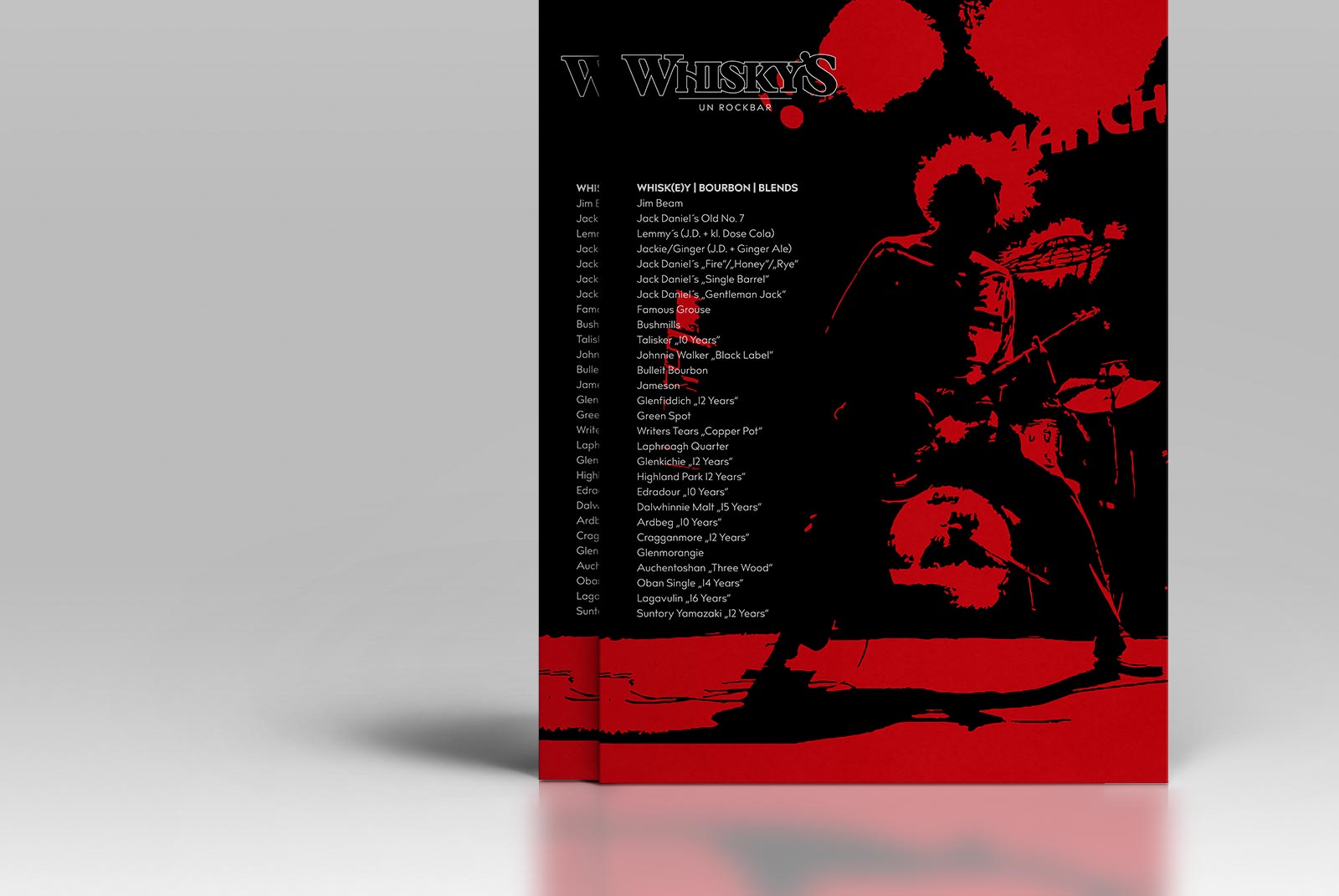
To get off on the good foot, the two asked states of grace to take care of graphic design. Starting with a new logo, ending up with a clear cut visual identity for signs, posters, flyers and menus. The result was a bold mix of tradition and clean cut modernism. From the transitional serif typeface used in the logo, to the modernist geometric sans used for headlines and plain text, typographically speaking. The duotone approach to the imagery and general layout, all set in plain red, black and white, gives the visual identity a raw yet elegant feel.